Explainability: end-users considerations
If we assume that explaining to the end-users how a machine learning (ML) model makes its predictions increases their trust on that model (side note: it can be debated if explaining a prediction is sufficient to establish trust, but in general we can assume that explaining contributes to increasing trust), the question is then “how and when we should explain the model’s prediction”.
Different types of explanations
There are different types (modalities) of explanations, nicely illustrated in the picture below, taken from this paper on interpretability in radiology, we can see an increasing amount of information given to the radiologist to explain how a model decided to classify a frontal chest x-ray.
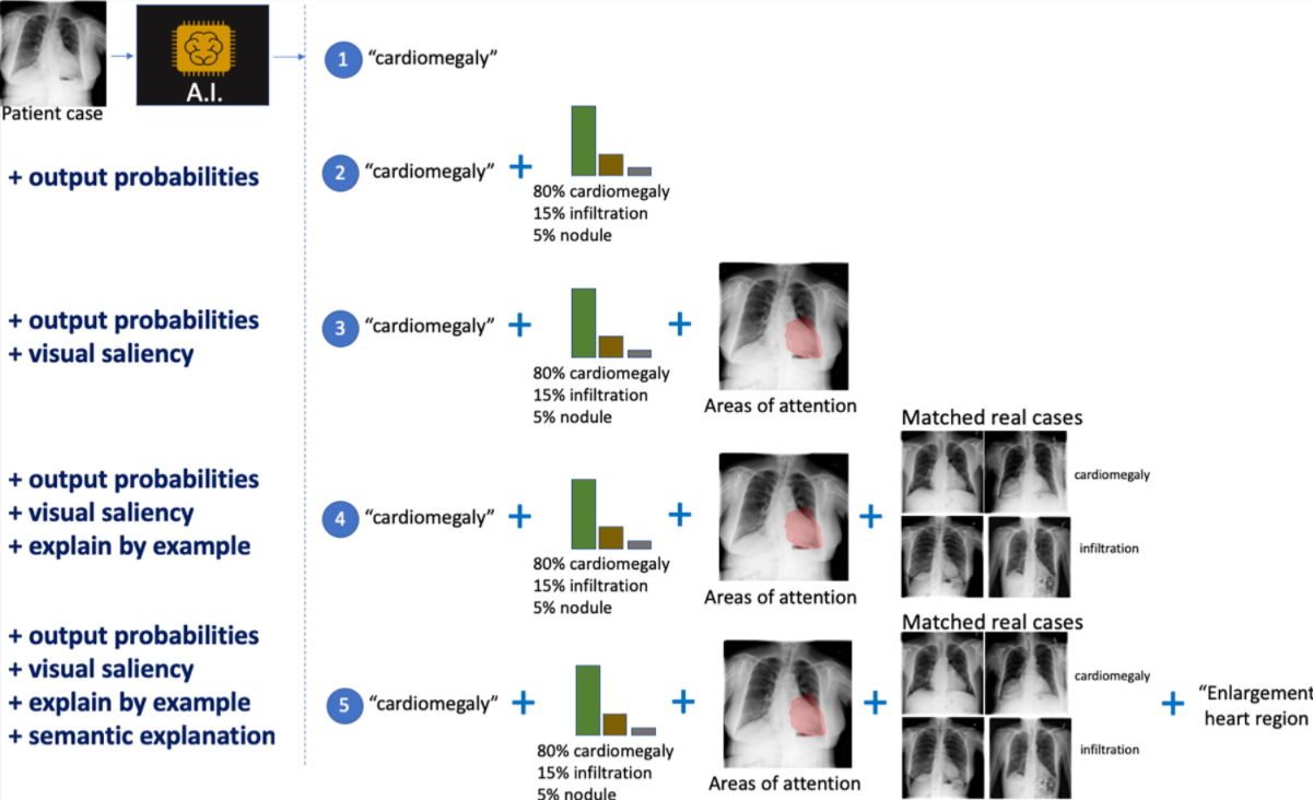
Some of them are the typical ones we see in machine learning explanations. In number two it adds the confidence level of the top classifications. In number three we can see the area of the image that was more significant (salient) for the model.
So far the explanations are more on the technical side. As we move to other modalities, we go beyond that one image under analysis. In number four we learn what real-life cases matched the same diagnosis when the model was trained. In number five we see a semantic explanation, i.e. not only why the heart is the salient part for the model (in number three), but a clinical description of why that is important (it shows an enlarged heart).
Is more explanation better?
The first time I came across the picture above, my reaction “this is a great tool to increase confidence (thus, trust) in what the model is doing”. But later I learned that there could be such a thing as “too much explanation”.
The picture is from this article on diagnosing diabetic retinopathy, an eye condition that can lead to blindness. As you may imagine from the description, the image is of the back of the eye (eye fundus).
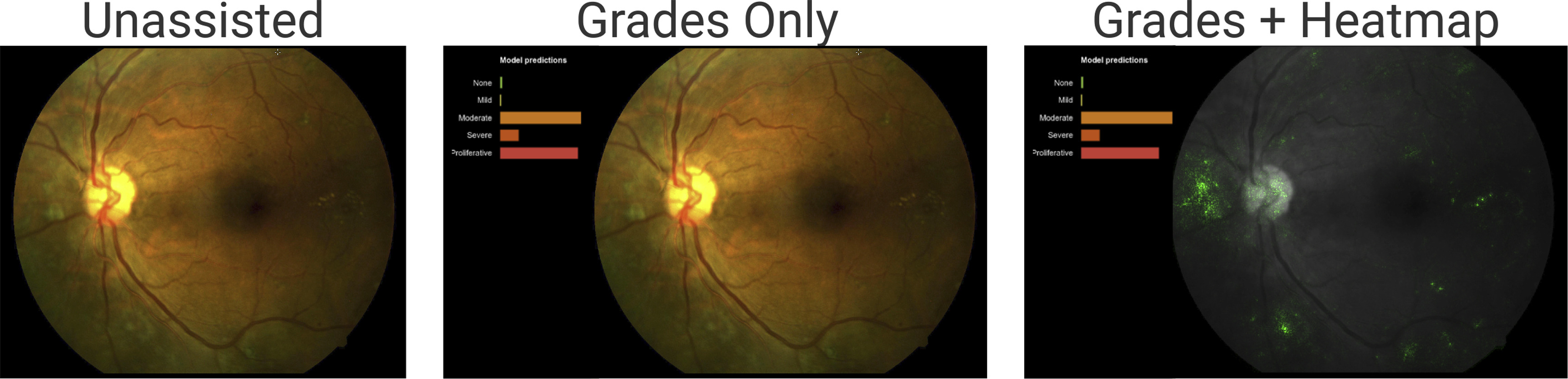
The model helps doctors diagnose diabetic retinopathy by presenting its assessment of the fundus image.
From left to right:
- The image, without any extra information. That’s what doctors see when not using any machine learning assistance.
- The image with the model predictions. The length of the bars indicates the model’s confidence in a prediction. The two largest bars are “moderate” (middle bar - yellowish) and “proliferative” (bottom bar - reddish).
- The image with the salient areas for the model (the green spots). These are the areas the model used to make the predictions.
At first glance, the “grades + heatmap” seems to be the most helpful way to present information to the doctors. More information couldn’t hurt, right? Well, it depends. The study found out that for patients that do not have diabetic retinopathy (DR), showing the grades and heatmaps decreased the doctors’ diagnosis accuracy. For patients with DR it did not affect the doctors’ diagnosis accuracy.
As the paper puts it:
“We showed that this effect was driven by a negative effect of heatmaps for cases with no DR: the heatmaps tended to cause readers to overcall these cases, in particular causing more false-positive grades of mild NPDR. This negative effect was expected. The integrated gradients method is designed mainly to show evidence for positive predictions (pathologic features in the case of DR), but is not expected to be useful for negative predictions.”
R. Sayres et al. — Using a Deep Learning Algorithm and Integrated Gradients Explanation to Assist Grading for Diabetic Retinopathy
That in itself was an interesting conclusion, but it goes further:
“However, we also observed that reader accuracy improved over the course of the experiment for grades plus heatmap. By the end of the experiment block, accuracy was comparable with the grades-only condition…. This suggests that over time, clinicians learned to use the heatmaps for guiding diagnosis.”
R. Sayres et al. — Using a Deep Learning Algorithm and Integrated Gradients Explanation to Assist Grading for Diabetic Retinopathy
How and when we introduce explanation is critical
Coming from an engineering background, where “more data is better” is a common belief, this is a fascinating result. It implies that we should not dump all the information to the users of a model but choose carefully what to display based on the context.
For example, in the diabetic retinopathy (DR) example showing the heatmap when the patient did not have DR was detrimental to the doctors’ accuracy. But we can’t stop there. Over time, as doctors got used to the system, the heatmap was no longer detrimental. Thus, the methods we use to explain a model may vary over time for the same group of users.
It shows the complexity of human/machine interaction and how much we still need to learn about the interpretability of machine learning models for the end-users of a model.
Beyond explaining one prediction
While this article focused on explaining one specific model prediction, other researchers are looking into what humans want when they ask for an explanation. For example, in Interpretable Machine Learning, A Guide for Making Black Box Models Explainable Christoph Molnar argues that “…humans prefer short explanations (only 1 or 2 causes) that contrast the current situation with a situation in which the event would not have occurred.” The technical term for that is “contrastive explanation”. There is more research ongoing in how it can be applied to machine learning explanation (for example, here, here, and here).
And, for a different approach altogether, Cynthia Rudin argues that we should “Stop Explaining Black Box Machine Learning Models for High Stakes Decisions and Use Interpretable Models Instead”.