Writing good Jupyter notebooks
Jupyter notebooks are an excellent tool for data scientists and machine learning practitioners. However, if not approached with a few techniques, they can turn into a pile of unintelligible, unmaintainable code.
This post will discuss some techniques I use to write good Jupyter notebooks. We will start with a notebook that is not wrong but is not well written. We will progressively change it until we arrive at a good notebook.
But first, what is a good Jupyter notebook? Good notebooks have the following properties:
- They are organized logically, with sections clearly delineated and named.
- They have important assumptions and decisions spelled out.
- Their code is easy to understand.
- Their code is flexible (easy to modify).
- Their code is resilient (hard to break).
This post is adapted from a guest lecture I gave to Dr. Marques’ data science class. If you are pressed for time, check out the GitHub repository, starting with the presentation.
We will use as an example a notebook that attempts to answer the question “is there gender discrimination in the salaries of an organization?” Our dataset is a list of salaries and other attributes from that organization. We will start from the first step in any data project, exploratory data analysis (EDA), clean up the dataset, and finally, attempt to answer the question.
To illustrate how to go from a notebook that is not wrong but is also not good, we will go through the following steps:
- Step 1: the original notebook, the one that lacks structure and proper coding practices.
- Step 2: add a description, organize into sections, add exploratory data analysis.
- Step 3: make data cleanup more explicit and explain why specific numbers were chosen (the assumptions behind them).
- Step 4: make the code more flexible with constants and make the code more difficult to break.
- Step 5: make the graphs easier to read.
- Step 6: describe the limitations of the conclusion.
Step 1 - The original notebook
This is the original notebook. It is technically correct, but far from what is acceptable for a project of this importance.
The first hint of a problem is the structure of the notebook: it doesn’t have any. It’s a collection of cells, one after the other.
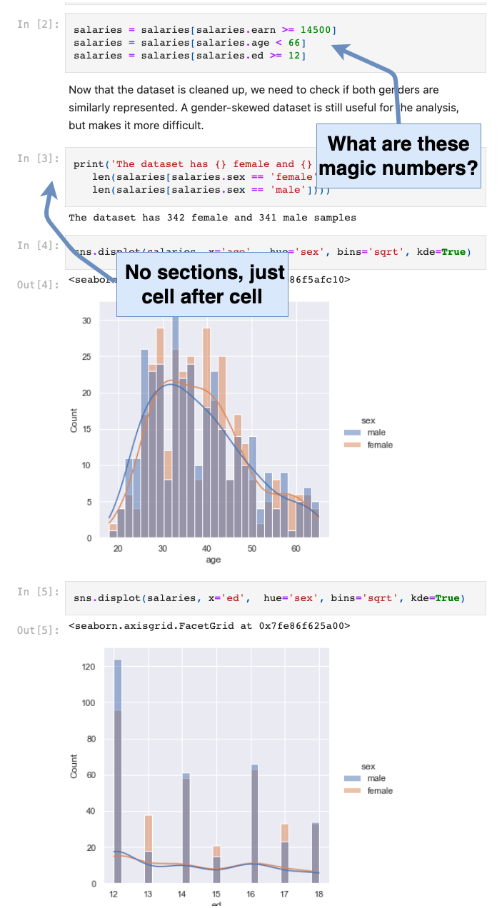
Other problems with this notebook:
- There is no description of what the notebook is about.
- There is no exploratory data analysis (EDA) to explain why we can (or cannot) trust our data.
- The data cleanup (the magic numbers) is not explained, e.g. why were those numbers used?
- Because of the magic numbers, the code is not flexible. We don’t know where they are used and the effect of changing one of them.
- There is no explanation for the code blocks.
- There is no explanation for the conclusion.
We will fix some of the issues in the next step.
Step 2 - Add a description, organize it into sections, and add exploratory data analysis
Starting in this step, we will make incremental changes to the notebook. Each change will bring us closer to a good notebook. Changes from the previous step are highlighted with a “REWORK NOTE” comment and an explanation of what has changed. Here is an example:
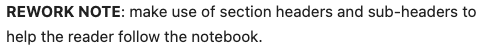
In this step, we make the following improvements:
- Add a clear “what is this notebook about?” description.
- Add an exploratory data analysis (EDA) section.
- Split the notebook into sections.
This is the reworked notebook. It is better, but we can still improve it:
- Make the data cleanup more explicit.
- Explain what the code blocks are doing.
- Explain why specific numbers were chosen (the assumptions behind them).
- Make the graphs easier to read.
- Make the code more flexible with constants.
- Make the code more resilient (harder to break).
- Describe the limitations of the conclusion.
We will fix some of the issues in the next step.
Step 3 - Make data cleanup more explicit and explain why specific numbers were chosen
In this step, we make the following improvements:
- Make the data cleanup more explicit.
- Explain why specific numbers were chosen (the assumptions behind them).
- Explain what the code blocks are doing.
The following figure shows how we explain why we are removing all employees that are 66 or older and add a reference to back up our decision (the hyperlink in the text). We also explain why we think this is a good decision.
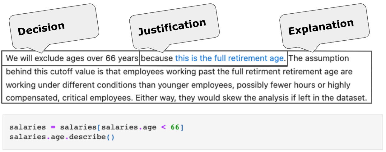
Why should we document decisions to this level of detail? One reason is to remember why we made them. But, more importantly, we, the data scientists, may not be the domain experts. In this example, the domain experts are the HR and legal departments. We need to engage them to validate our decisions. Documenting to this level of detail invites a dicussion with the domain experts to validate the decisions.
This is the reworked notebook.
Step 4 - Make the code more flexible and more difficult to break
In this step, we make the following improvements:
- Make the code more flexible with constants. If we need to change decisions, for example, the age cutoff, we have only one place to change.
- Make the code more difficult to break. By following patterns, we reduce the chances of introducing bugs.
In this piece of code, we remove everyone who made less than the minimum age working full time (see the notebook for details).
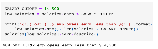
There are a few notable items in this code:
- We use a constant if we need to make changes later (more flexible code).
- We use a generic name for the constant (
SALARY_CUTOFF), so we don’t need to change it later if we change the cutoff value. If we had named it something more specific, likeMINIMUM_WAGE, we would need to change the constant name if we changed the value. This makes the code less flexible and less resilient. - We don’t modify the original data. We create a filter instead, so we can see the effect of each filter separately and backtrack one change at a time if we need to.
- The filter variable also has a generic name (
low_salaries), for the same reasons we used a generic name for the constant. - We print the results of the operation (the cutoff value and how many items it removed from the dataset), so we can discuss with the domain experts if our decision makes sense. For example, we could ask an HR representative if they expected to see this many employers removed when we set this salary cutoff. It may catch errors in the dataset or in the code.
Regarding the last item, printing the operation results: showing the effect of filtering data (how many employees were removed) helps validate the decisions with the domain experts.
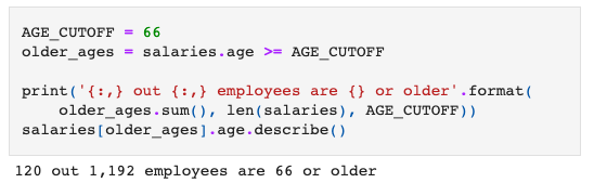
When we clean up the age column, we keep using the same patterns:
- We create a filter for the data we want to exclude, as we did for the salary filter.
- We follow a pattern for the variable name. The salary one was named
SALARY_CUTOFF, so this one is also suffixed with..._CUTOFF. - We choose a generic variable name. If we name it something more specific, e.g.
RETIRED_AGEand decide to change the age cutoff later, theRETIRED_part may no longer make sense. A generic name (AGE_CUTOFF) requires only a change to the value, making the code more resilient.
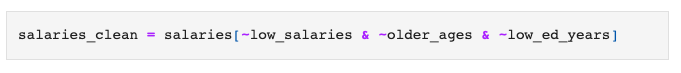
With all the filters in place, we can clean up the data in one step. Because all the filters we created are to exclude data, we can confidently negate all of them to get the data we want to keep. If we use different types of filters (exclude and include), we have to carefully think about how to apply each of them, opening the door for bugs.
This is an important concept: don’t make your brain hold more information than it absolutely has to (don’t create extraneous cognitive load). If we follow a pattern, we have only one thing to remember, the pattern itself.
This is the reworked notebook.
Step 5 - Make the graphs easier to read
In this step, we make the graphs easier to read.
First, we add transparency when plotting multiple variables on the same graph.
This is the pairplot from the previous step, without transparency:
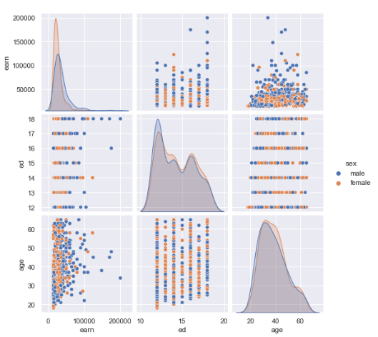
And this is the pairplot with transparency:
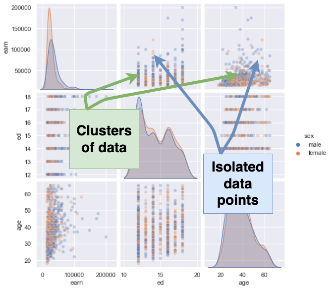
Adding transparency lets us see the clusters of data, the areas where we have many data points, as opposed to the places where we have few data points. It helps identifies patterns in the data.
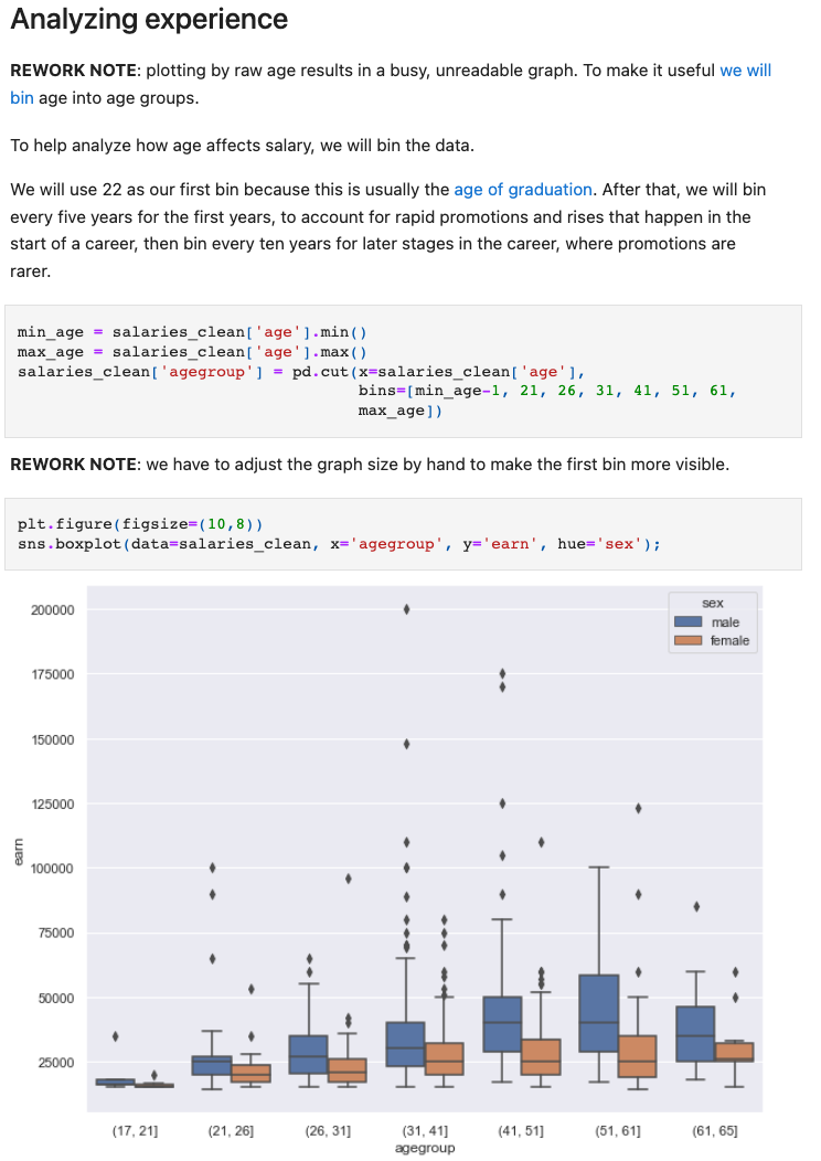
Another technique to make graphs readable is to bin the data. This is the graph from the previous step that plots age vs. salary:
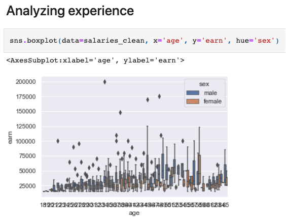
It is impossible to see any pattern in such a graph. To make it more legible, we will bin the data. But the question is, “what bins make sense for this case?” Since we are analyzing salaries, we chose 22 as our first bin because this is usually the age of graduation. After that, we will bin every five years for the first years to account for rapid promotions and rises that happen at the start of a career, then bin every ten years for later stages in the career, where promotions are rarer. We also document those assumptions clearly to discuss them with the domain experts.
This is the new graph:
This is the reworked notebook.
Step 6 - Describe the limitations of the conclusion
We now have a good notebook. It is organized in sections, uses constants to make the code more understandable and resilient, the graphs are well formatted, and we added explanations for all assumptions and decisions.
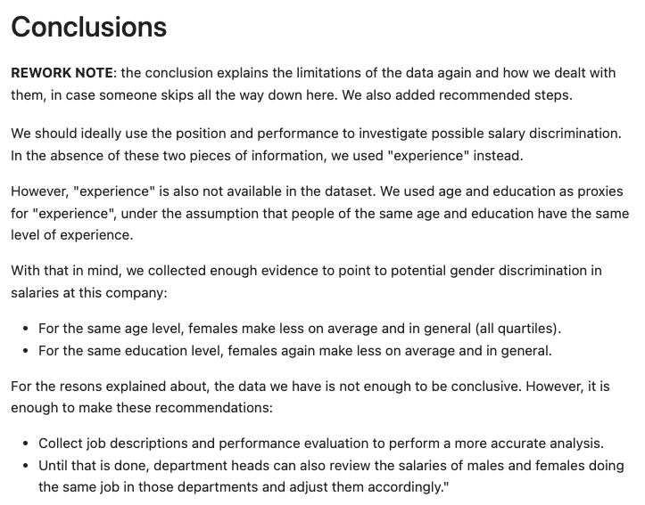
We are now at the last step, where we present the conclusion to the original question, “is there gender discrimination in the salaries of an organization?”.
In real life, the data we have is not perfect and complex questions don’t always have simple answers. And that’s the case here. We have a few limitations that prevent us from giving a definitive answer to the question. But we have enough to spur some action. Our job at this point is to document what we found and the limitations of our analysis.
In the conclusion section, we clearly document:
- That we used proxy variables.
- Despite the dataset’s limitations, we have tentative conclusions.
- That we need more precise data, but at the same time, we have enough to take action (and avoid analysis paralysis).
Conclusion
We write notebooks for our stakeholders, not for ourselves.
To write good notebooks, we need to:
- Organize them logically so that the stakeholders can follow the analysis.
- Make the code easy to understand, easy to change (flexible), and hard to break (resilient), so we can modify it confidently as we review the results with the stakeholders.
- Spell out critical assumptions and decisions so stakeholders can validate them (or challenge them).
- Clearly document the limitations of the analysis so stakeholders can decide if they are acceptable or not.
Running the examples
The notebooks are available on this GitHub repository.